There are many ways to present your data, but sometimes simplest solutions are best ones.
In this case, JavaScript library Bluff by James Coglan (which is released under the GPL and MIT licenses) comes with amazingly easy API to work with, but still in many cases it can be 'the' tool you needed for your data representation.
Three small files are required: js-class.js (8 kb), bluff-min.js (42 kb) and if using Internet Explorer excanvas.js (12 kb).
Let's jump start to Line Chart Graph, it's an easiest way to understand how this library works.
First we need some space to draw and that's obviously our canvas. Use proper dimensions and id.
<canvas id="example" width="500" height="300"></canvas>
Now, all we have to do in order to present our data is create new Bluff.Line class like this:
  <script type="text/javascript">
    var g = new Bluff.Line('example', '500x300');
    g.title = 'Products Stats';
    g.tooltips = true;

    g.theme_rails_keynote();

    g.data("Product B", [4, 7, 9, 10, 8, 5]);
    g.data("Product C", [4, 8, 7, 9, 4, 2]);
    g.data("Product D", [2, 3, 1, 5, 6, 8]);
    g.data("Product A", [9, 9, 10, 8, 7, 9]);

    g.labels = {0: 'April', 2: 'Jun', 5: 'September'};

    g.draw();
  </script>
Notice how canvas id and Line class first argument are identical. In this way you connect canvas with its content.
Just as a practice, copy canvas and script code and paste it below, but instead of 'example' put something like 'example2' and within example2 change width to 400. Refresh your page and you will get one canvas below the other. This is how you can get multiple charts on the same page.
Graph title is first text line, you can change that. Also, if you set graph tooltip to be true, your tooltip will show node information when you move your mouse above it. Check image above and notice 'Product C 7' as an example.
Even better, tooltip box can be styled using CSS. It is within bluff-tooltip div class. This means adaptation to your own data presentation style. Remember not all graph types support tooltips, but many of them does.
OK, now that I've mentioned graph types, I must say there are many of them included into Bluff library. Here is complete list of it: AccumulatorBar, Area, Bar, Dot, Line, Mini.Bar, Mini.Pie, Mini.SideBar, Net, Pie, SideBar, SideStackedBar, Spider, StackedArea and StackedBar.
Total 15 of them! This should be enough for your basic data presentation needs.
You have already seen how Line graph looks like from the image above.
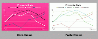
Now, let's talk more about Themes. You have seen (in first example) something like g.theme_rails_keynote() and you probably wondered what it was? Well, it's one of default style themes applied to data graph. Others default themes are: theme_keynote(), theme_37signals(), theme_odeo(), theme_pastel() and theme_greyscale().
Why rails you may ask, is that coincidence? It's not, actually Bluff library is port of the Gruff graphing library for Ruby. Now you know the truth :)
There are small but significant stylish differences between themes. Here are how same data graph looks like using theme_keynote() and theme_37signals().
Besides these, there are three more built-in themes. One of them is grey scale, it represents just that: grey scale data graph, so no much fun there but useful in some situations.
Other two build-in themes are Odeo theme and Pastel theme as shown on picture below.
You have a choice to set graph theme manually if you don't like default themes. To do this you use set_theme method before everything else and you have four parameters: colors, marker_color, font_color and background_colors.


